Convert PowerPoint to Keynote (and back) without losing quality

Keynote can open a PowerPoint file and vice versa, but the result is rarely perfect. Replaced fonts, lost animations, shifted objects and charts turned into images: as soon as a deck is a little polished, a clean rebuild is needed.

What goes wrong with automatic conversion

  • Fonts: if a font is not installed, it is replaced and the whole layout shifts.
  • Masters: layouts are imported but often poorly recognised, which makes later edits harder.
  • Animation: Morph (PowerPoint) and Magic Move (Keynote) do not match exactly; many effects are simplified or dropped.
  • Charts: Excel-linked or custom charts sometimes become non-editable images.
  • Video: some formats are not supported by the other application.

How to get a clean conversion

  1. Install the deck’s fonts on your computer before opening the file.
  2. Recreate the theme (colours, fonts, layouts) in the target application.
  3. Move the content slide by slide into the right layouts.
  4. Rebuild animations with native tools: Magic Move in Keynote, Morph in PowerPoint.
  5. Rebuild charts with the native chart tool so they stay editable.
  6. Test on the final presentation machine.

When should you call a designer?

For a few simple slides, automatic conversion is fine. For a conference deck, a pitch or a corporate template, a rebuild by a designer fluent in both applications avoids nasty surprises on the day.

Frequently asked questions

Is automatic PowerPoint to Keynote conversion reliable?

For a simple deck, yes. As soon as there are specific fonts, animation, charts or complex masters, a manual rebuild gives a much better result.

Are animations preserved?

Only partly. Morph and Magic Move do not map perfectly, and complex animations often need to be rebuilt.

Do charts stay editable?

Simple charts do, but Excel-linked data and custom charts are often turned into images and must be rebuilt to stay editable.

I convert and rebuild presentations between PowerPoint and Keynote while keeping their layout: see Keynote designer and PowerPoint designer.

How to create a corporate PowerPoint template people actually use

A good corporate PowerPoint template is a file anyone can use without breaking the brand guidelines. It relies on a theme (colours and fonts), a slide master and a set of ready-to-use layouts. Here is the method I use for large companies.

1. Start from real use cases, not just the brand book

Before designing, list the presentations teams actually produce: board meetings, sales decks, results, training. Each use case reveals layout needs: lots of text, lots of figures, lots of images.

2. Define the theme

  • Theme colours: brand colours placed in the right slots (text, background, accents) so charts and SmartArt pick them up automatically.
  • Theme fonts: one heading font and one body font available on every computer, or a compatible fallback.

3. Build the slide master and layouts

  • Use real placeholders (title, text, picture, chart) rather than free text boxes.
  • Include the key layouts: cover, section divider, title and text, two columns, full-bleed image, charts, key figures, quote, closing slide.
  • Put the logo, page numbers and legal notice in the master so they are never moved by mistake.
  • Name each layout clearly (“02 – Title + text”) so users find their way.

4. Add an asset library

Icons, pictograms, maps, standard diagrams and examples of good slides save a huge amount of time and prevent off-brand creations.

5. Test with real users

Ask two or three colleagues to rebuild an existing deck with the new template. Their difficulties show what to simplify before roll-out.

6. Roll out and maintain

Save the file as .potx, distribute it through Microsoft 365 shared templates, and appoint someone in charge of updates.

Frequently asked questions

What is the difference between a theme, a slide master and a PowerPoint template?

The theme holds colours, fonts and effects; the slide master defines the structure of the slides; the template (.potx) is the file that brings it all together and serves as the starting point.

How many layouts should a template include?

Between 10 and 25 is enough in most cases: cover, section divider, title and text, two columns, image, charts, key figures, quote, closing slide.

How do I roll out a template to the whole company?

Through the shared templates folder in Microsoft 365 or the organisation asset library, so everyone always starts from the latest version.

I design custom PowerPoint templates for companies and agencies, and have done since 2001. Let’s talk about your project: please@nextslide.fr.

PowerPoint or Keynote for a conference: which should you choose?

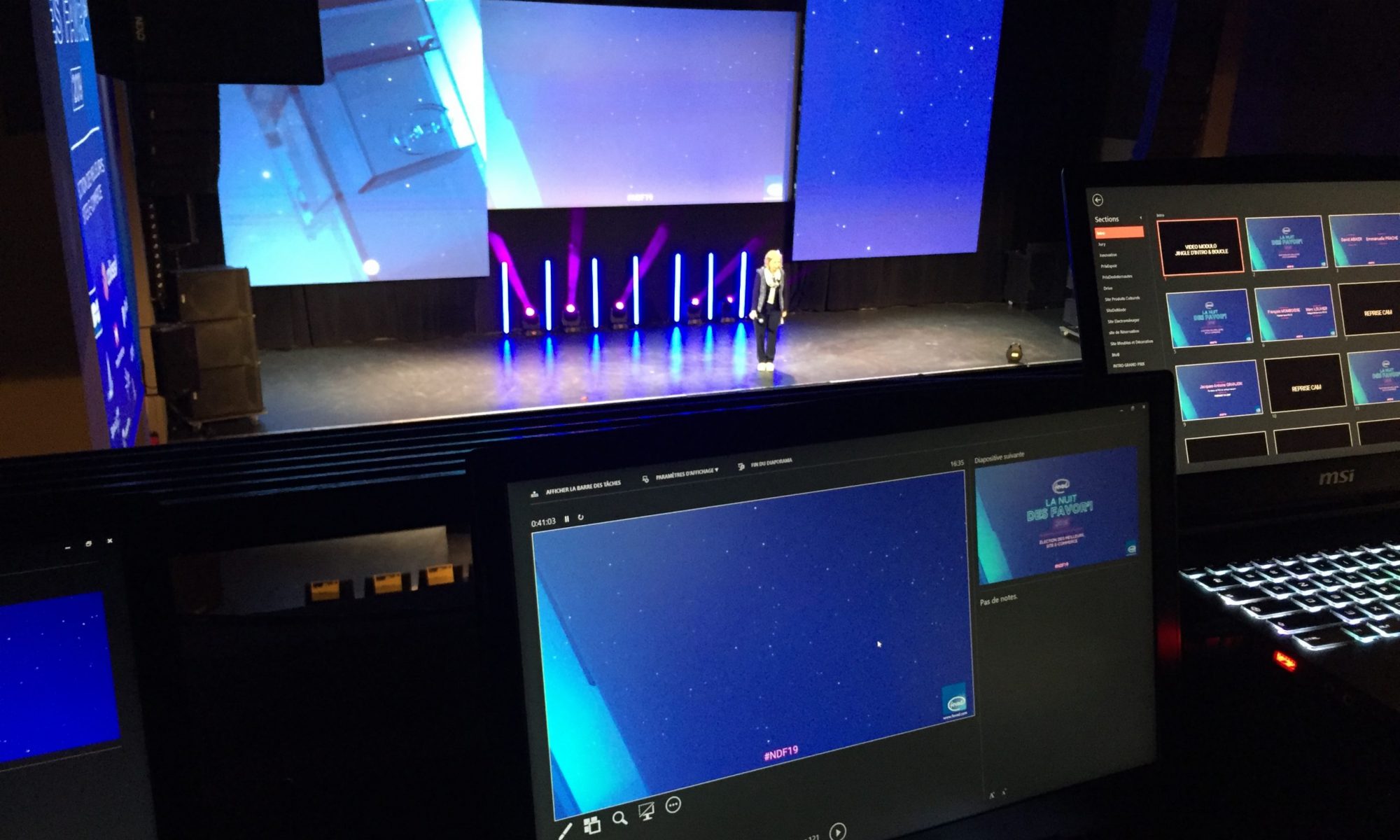
For a conference, PowerPoint is the safest choice and Keynote the most spectacular. PowerPoint works with almost every AV setup and computer; Keynote offers smoother animation but only runs on Mac. The right choice depends on the AV team, the speakers and how the deck will live after the event.

PowerPoint strengths

  • Compatibility: the standard in companies and for most event AV teams.
  • Collaboration: co-editing in Microsoft 365, comments, version history.
  • Corporate templates: masters and layouts shared by every team.
  • Morph transition: smooth animation, close to Keynote when well built.

Keynote strengths

  • Rendering: typography, anti-aliasing and animation often finer by default.
  • Magic Move and builds: very fluid sequences, ideal for a product launch.
  • Stability on Mac: video-heavy files stay smooth on a presentation Mac.

Watch out for

  • Keynote requires a Mac: check the AV team has one, or bring your own.
  • Fonts: whatever the software, fonts must be installed on the playback machine or embedded.
  • Video: use compatible formats (MP4 H.264) and test on the final machine.
  • 16:9 or custom screens: ask for the exact resolution, especially for panoramic LED walls.

A designer’s advice

The safest approach is often to design in the software the AV team knows best, then deliver a backup: PDF, video of animated sequences, or a version in the other software. I regularly deliver the same deck in both PowerPoint and Keynote when speakers work on different machines.

Frequently asked questions

Keynote or PowerPoint: which looks better?

Keynote offers smoother animation and finer typography out of the box, but a PowerPoint deck built by a designer can be just as elegant.

Can a Keynote file be played on a PC?

No, Keynote only runs on Mac, iPad and iPhone. For a PC, export to PowerPoint, PDF or video.

Which format should I give the event AV team?

Always ask the AV team which format they expect. Many accept both, but PowerPoint remains the most widespread standard.

Need an expert eye for your event? See PowerPoint designer and Keynote designer.

How much does a PowerPoint designer cost?

The price of a PowerPoint designer mainly depends on three things: the number of slides, their complexity and the deadline. Simple formatting does not cost the same as a full corporate template or a conference deck with infographics and animation. Here is how to find your way.

What drives the price

  • Type of job: formatting an existing deck, designing a custom presentation, creating a template (masters, layouts, libraries) or event support.
  • Number of slides and the share of complex ones: diagrams, infographics, data charts, maps.
  • Animation: Morph transitions, logo animations, embedded video.
  • Deadline: rush work (nights, weekends, 24-hour delivery) takes more resources and costs more.
  • Quality of the input: final text and clear brand guidelines greatly reduce back-and-forth.

Typical budgets

Most freelance PowerPoint designers charge by the day or a fixed price. In France, the average day rate on freelance platforms is generally between €400 and €600 excluding VAT, with senior corporate specialists above that. As a rough guide:

  • Formatting an existing deck: a few hours to one or two days depending on volume.
  • Custom presentation: usually one to several days.
  • Corporate PowerPoint template: often two to five days, depending on the number of layouts and assets.
  • Conference or plenary support: depends on volume, possibly with an on-site day.

Be wary of very low per-slide prices: they rarely mean clean files built on slide masters that your teams can reuse.

How to get an accurate quote

  1. Send the existing file or content, even rough.
  2. Attach your brand guidelines (logo, colours, fonts).
  3. Give the deadline and how the deck will be used (projection, print, email).
  4. Say who will edit the file afterwards: it changes how it should be built.

Frequently asked questions

What is the day rate of a freelance PowerPoint designer?

It varies by country and experience. In France, the average day rate of a presentation designer on freelance platforms is generally between €400 and €600 excluding VAT; senior specialists and rush jobs cost more, and rates in the UK or US are often higher.

Fixed price or day rate?

A fixed price suits well-defined projects (a template, a deck of N slides). A day rate suits evolving assignments or on-site support during an event.

How can I reduce the cost of a presentation?

Provide final content, clear brand guidelines and a reasonable deadline. Text revisions and rush jobs are what push the bill up most.

Have a project? I’ve been a freelance PowerPoint designer since 2001 and I reply to every request the same day with a precise quote: please@nextslide.fr.

Case study: an evolving screen backdrop for a pharmaceutical plenary

For a plenary session dedicated to two of its products, a major pharmaceutical company wanted a screen backdrop that tells a story throughout the day, rather than just title slides.

  • Client: international pharmaceutical company
  • Deliverable: full-screen, evolving trompe-l’œil PowerPoint backdrop
  • Theme: “Exploration”
  • Tools: PowerPoint, Illustrator

The brief

The chosen theme was exploration: a map whose territories, one per product, are revealed as the programme unfolds, with other territories still “to be discovered”. The backdrop had to respect each product’s colours and stay consistent with the plenary videos.

What I did

  • Map design: territories drawn from the product logos, for an instant visual link.
  • Progressive reveal: each part of the programme colours a new territory, from grey to the brand colours.
  • Variations: versions with titles, with key figures, and a clean version for speaker slots.
  • Coordination: visuals sent as they were ready to the video teams to keep a single graphic line.

The result

A visual thread running through the whole plenary, giving meaning to the programme and showcasing each product in turn.

Got a similar project? Send your files and deadline to please@nextslide.fr or call +33 6 03 52 62 28: same-day reply. See also PowerPoint designer and Keynote designer.

Case study: a 65-page product catalogue generated in PowerPoint for a defence manufacturer

A European defence manufacturer needed to produce a catalogue of its systems quickly, from technical data held in an Excel file, with the same finish as its printed brochures.

  • Client: European defence manufacturer (confidential)
  • Deliverable: 65-page product catalogue in editable PowerPoint
  • Timeline: a few weeks, delivered on the agreed date
  • Tools: PowerPoint, Excel, generation scripts, Illustrator

The brief

The data (specifications, land, naval or air domains, visuals) lived in a spreadsheet. The sheets had to be consistent, true to the style of the existing brochures, and remain editable by the teams for future updates.

What I did

  • PowerPoint templates modelled on the client’s brochures: white pages, colour bands by domain, brand fonts.
  • Automatic generation of the 65 sheets from the Excel file, then manual finishing of every page.
  • Brief changes absorbed: new products and specific inserts added mid-project without delaying delivery.
  • Quality control: systematic font and typography checks before delivery.

The result

A complete, consistent and editable catalogue, delivered on the agreed date, that the teams can update themselves whenever the range evolves. Data and visuals remained confidential throughout the project.

Got a similar project? Send your files and deadline to please@nextslide.fr or call +33 6 03 52 62 28: same-day reply. See also PowerPoint designer and Keynote designer.

Case study: the corporate presentation of a European space leader, in three languages

A major player in the European space industry, prime contractor for launcher programmes, wanted to modernise its corporate presentation and give its teams consistent, easy-to-use PowerPoint tools.

  • Client: major European space and defence group (confidential)
  • Deliverables: corporate presentation in 3 languages, print version, PowerPoint templates for employees
  • Tools: PowerPoint, Illustrator

The brief

The corporate deck had to reflect a high-tech group, exist in three languages without drifting from one version to another, and work both on screen and in print. Teams also needed templates they could edit themselves “without breaking everything”.

What I did

  1. Art direction: several design routes, then a chosen route with left-aligned section dividers, rounded-corner photos and discreet page numbering.
  2. Three language versions: one master structure for every version, so the layout stays identical despite different text lengths.
  3. “Light” print version: lighter backgrounds and reworked visuals for a clean result on paper and sensible ink use.
  4. Internal templates: clean slide masters and layouts, a standard footer (group logo and legal notice), text areas locked where needed.

The result

A consistent presentation across all three languages, ready for screen and print, and templates employees can use every day while staying on brand.

Got a similar project? Send your files and deadline to please@nextslide.fr or call +33 6 03 52 62 28: same-day reply. See also PowerPoint designer and Keynote designer.

Case study: a 193-portrait mosaic that turns into a logo, for VINCI Construction

For its ComDays, an internal event, VINCI Construction wanted a powerful on-screen moment that put its own people centre stage.

  • Client: VINCI Construction (client since 2017)
  • Deliverable: animated photo-mosaic sequence for the event screen
  • Volume: 193 employee portraits
  • Tools: PowerPoint, automation scripts, After Effects for the video version

The brief

Bring nearly 200 employee portraits together in a single image and reveal the VINCI logo from those faces, in a format ready to be played on the day of the event.

What I did

  • Photo preparation: cropping and colour-matching every portrait for a consistent result.
  • Automation: a script places each photo in the grid, which made it possible to go from 109 to 193 portraits mid-project without redoing everything by hand.
  • Animation: the portraits appear, then rearrange to reveal the logo, delivered both as a PowerPoint and as a video for the AV team.

The result

An opening sequence that puts employees at the heart of the message, delivered on time despite more than 80 extra photos added along the way.

Got a similar project? Send your files and deadline to please@nextslide.fr or call +33 6 03 52 62 28: same-day reply. See also PowerPoint designer and Keynote designer.